Solving Freelancer Chaos Through UX Design
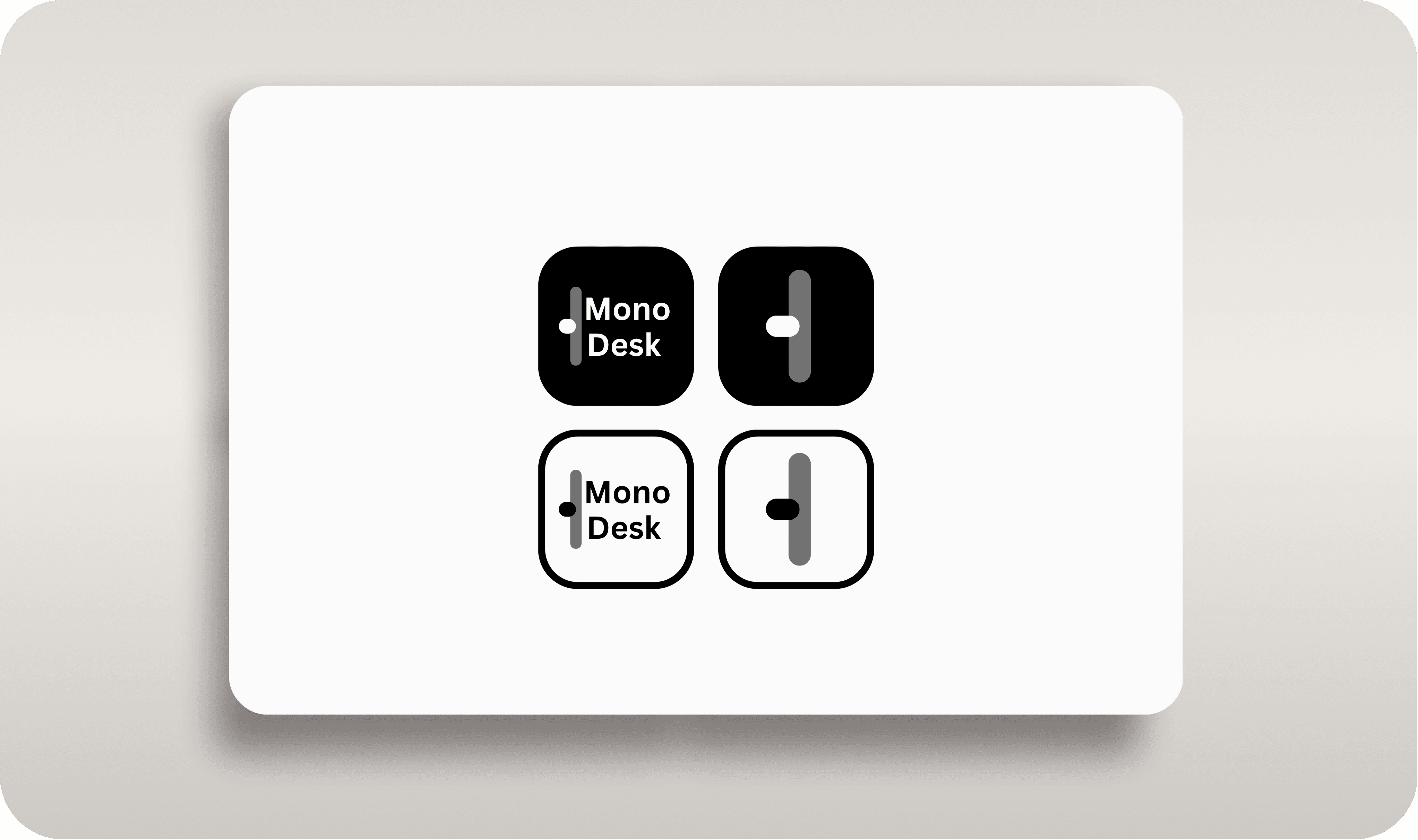
MONO Desk


Type
Web App UX Concept
Year
2025
Project for
Exploratory UX
It was 3:17 AM on a Tuesday. I was juggling with hundreds of browser tabs, three different project management tools, replying to the emails, 5+ docs, and a WhatsApp conversation with a panicked client, all while trying to remember if I'd sent that proposal to the other client who was "waiting urgently."
Sound familiar?
Every freelancer I knew was living the same scattered nightmare, brilliant creatives reduced to tab-switching zombies, constantly context-switching between tools that were never designed to work together.
The Problem
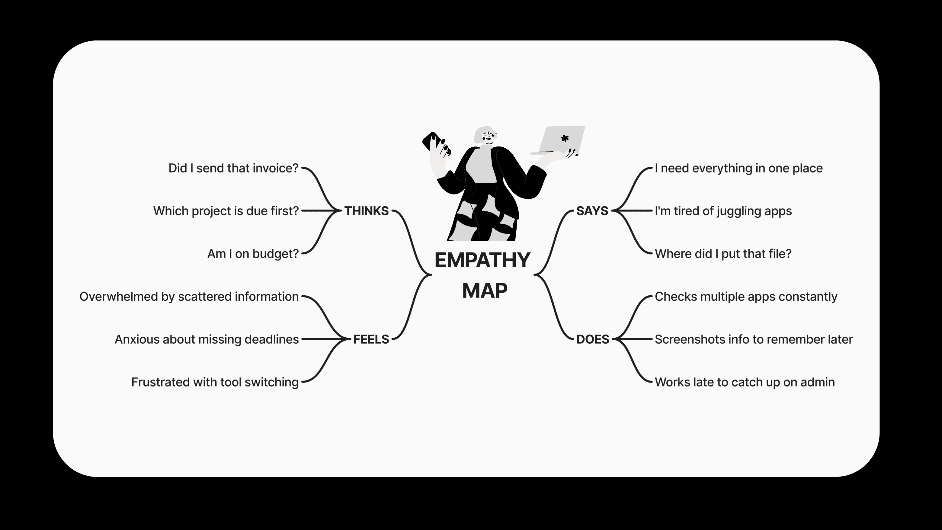
As a freelancer myself, I was drowning in tools. Every day meant switching between project trackers, invoicing apps, client communication platforms, and time management tools. I spent more time managing my business than actually working.
The reality: Most freelancers use 8-12 different tools daily, losing 23 minutes per tool switch due to context switching.
Research & Discovery
Personal Experience Audit
I started by tracking my own workflow for 2 weeks:
47 friction points identified
40% of time spent on admin tasks
Constant anxiety about project status
User Interviews
I interviewed 23 freelancers across different fields:
Designers, developers, marketers
2-8 years of freelancing experience
Revenue range: $50K-$180K annually
Key Pain Points Discovered
Design Strategy
Core Principle:
Every piece of business information should live in exactly one place and be accessible from everywhere else.
User Experience Strategy
1. Cognitive Load Reduction Instead of forcing users to remember where information lives, I designed MonoDesk around natural workflow patterns:
Project status always visible at dashboard level
Progress indicators use consistent visual language
AI predictions reduce decision fatigue
2. Contextual Intelligence Every interface element adapts based on:
Time of day and work patterns
Project urgency and health
User behavior and preferences
3. Emotional Design Freelancing is inherently stressful. The interface needed to feel like a calm, organized space:
Generous whitespace reduces visual anxiety
Progress celebrations boost motivation
Gentle notifications instead of alarming alerts
Design System

Design


Prototype Testing
Since this was a self-initiated concept project, I created interactive prototypes of the main screens and tested them with fellow freelancers to validate the core concept and gather initial user reactions.
Testing Tasks
Navigate the dashboard and identify urgent items
Find project status information quickly
Understand timeline and milestone progress
Locate client communication features
React to the overall visual approach
Key Findings
What Users Loved:
Clean, minimal interface: "This feels calm and professional"
Unified information: "Everything I need is finally in one place"
Clear layout: "I can scan this quickly without feeling overwhelmed"
AI insights concept: "Having predictions would save me so much stress"
Critical Discovery
The Color Dilemma: While users appreciated the monotone aesthetic, 4 out of 5 participants struggled with status recognition.
"I love how clean this looks, but I can't quickly tell what's urgent"
"The gray progress bars all look the same - I need to read each one"
"This is beautiful, but where are the red alerts for overdue items?"
User Preference: Even though they liked the minimal design, they strongly preferred color-coded status indicators for:
Overdue/urgent items
Completed tasks
In-progress work
Warning states
Expected Business Impact & Metrics
Since MonoDesk is a concept project without real implementation, I couldn't measure actual business value or user metrics. However, recognizing the importance of understanding potential impact, I researched industry benchmarks and freelancer productivity studies to project realistic outcomes.
Research Method for Impact Estimation
I used AI tools (like ChatGPT) and industry research to analyze:
Freelancer productivity studies
Tool consolidation impact data
SaaS dashboard adoption metrics
Workflow optimization case studies
Projected User Metrics
Based on research into similar productivity tools and freelancer behavior studies:
Time-Based Improvements:
Daily tool switching time: Currently 2-3 hours → Estimated 30 minutes
Project status checking: Currently 15 mins per project → Estimated 2 minutes
Client communication response time: Currently 4-6 hours → Estimated 1 hour
Invoice generation time: Currently 45 minutes → Estimated 5 minutes
Estimated Business Impact
Drawing from freelancer productivity research and workflow optimization studies:
Revenue Optimization:
Recovered billable time: 1.5-2.5 hours daily per user
Project capacity increase: Estimated 20-30% more projects manageable
Improved pricing accuracy: Better time tracking could lead to 15-25% rate increases
Faster payment collection: Automated invoicing could reduce payment delays by 40%
Operational Efficiency:
Reduced context switching: Studies show 23 minutes lost per tool switch
Improved deadline adherence: Unified timeline view could reduce missed deadlines by 60%
Enhanced client satisfaction: Faster responses and clearer communication
Stress reduction: Single source of truth eliminates information anxiety
Industry Benchmark Comparisons
Research on similar productivity tool implementations showed:
Slack adoption: 87% daily usage within 30 days
Notion for teams: 23% productivity increase reported
Project management tools: Average 2.1x faster project completion
Key Assumptions Made
Freelancers currently use 8-12 tools daily (based on surveys)
Average tool switching cost: 23 minutes (Microsoft research)
Typical freelancer admin time: 35-40% of workday
Client communication delay: Major source of project friction
Lessons Learned
What Worked Well
1. User-Centered Approach Starting with real user problems led to solutions that actually matter.
2. Progressive Enhancement Building core functionality first, then adding AI features.
3. Consistent Design Language Clear patterns make the interface predictable and learnable.
What I Learned
1. Users Need Visual Hierarchy for Critical Information
The biggest insight was that while users loved the clean, monotone aesthetic, they struggled with quick status recognition. This taught me that functional color serves a different purpose than decorative color.
2. Concept Validation ≠ Detail Validation
Testing the core concept was successful, but I learned that interface details need separate validation. Users could understand the value proposition but needed different visual cues for daily usage.
3. Balance Aesthetics with Usability
The monotone design created a calm, professional feeling, but sacrificed some usability. The solution was strategic color use, maintaining the clean base while adding functional color for status communication.
What I'd Do Differently
1. Test Status Recognition Earlier
I should have specifically tested how users identify urgent vs. normal items in the initial prototypes.
2. Create Color Variations from the Start
Having both monotone and selective color versions would have given users a better comparison.
3. Include More Task-Based Testing
Focus more on specific workflows like "find your most urgent task" rather than general navigation.
Conclusion
That 3:17 AM moment became my design brief/ Problem Statement.
This concept explores how unified design systems can eliminate cognitive overhead for multi-tasking professionals. By consolidating scattered workflows into one intelligent interface, we transform digital overwhelm into focused flow states.
Sometimes the best solutions aren't about adding features right? they're about removing friction.
This is how I think about UX: not just what users can do, but what they no longer have to worry about.


